As a team, our mandate was simple: do whatever we can as a company to make it easier for our customers to get roadside assistance. We are doing that by providing an easy way to request it within the app and track the service provider when en route. We first started by providing a phone number to speak to an agent, and over time, we’d like to absorb as much of that process into the FordPass application as possible.

Number of users requesting assistance via the app: request roadside assistance in a simple way and track the service provider when en route.
Reduce the number of request calls: due to waiting on hold for an operator to even start the process of asking for help.
Retention of the customer on the FordPass application: keeping the experience simple.
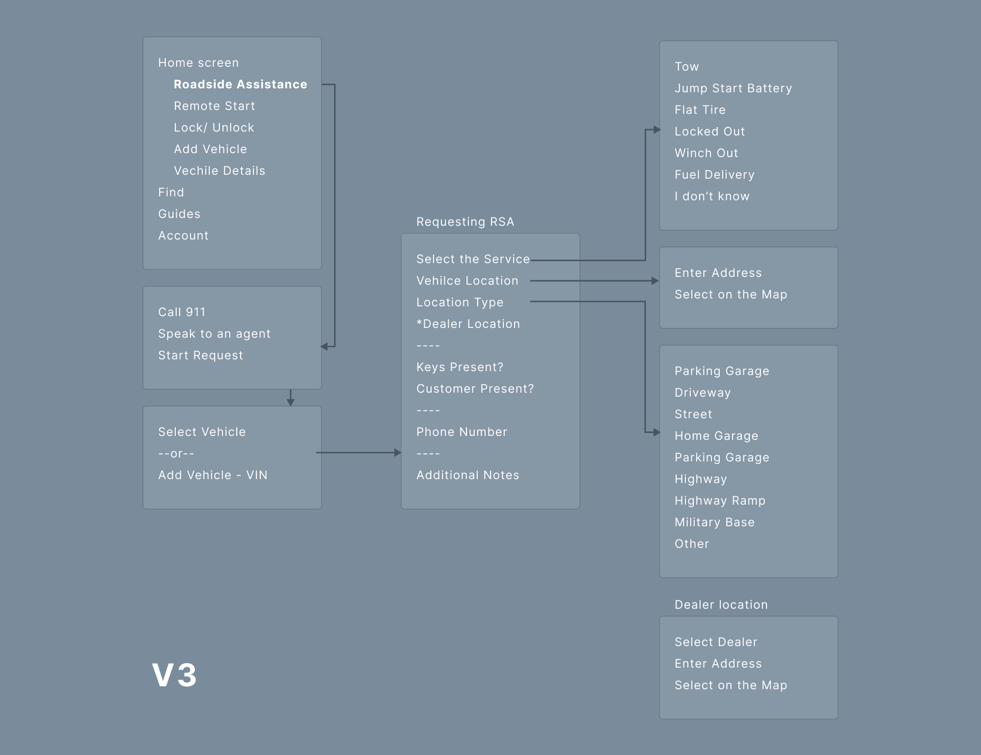
Although the roadside assistance problem was wide and encapsulating of a complicated process of tracking both the customer as well as the service vehicle, I wanted to improve and simplify the way the user would approach the situation. I mapped out all the important information necessary for the service provider to be prepared when aiding.
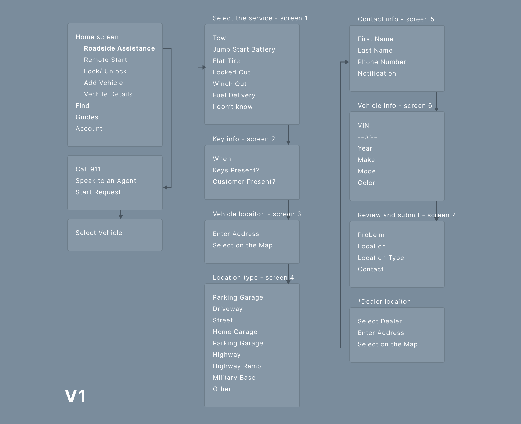
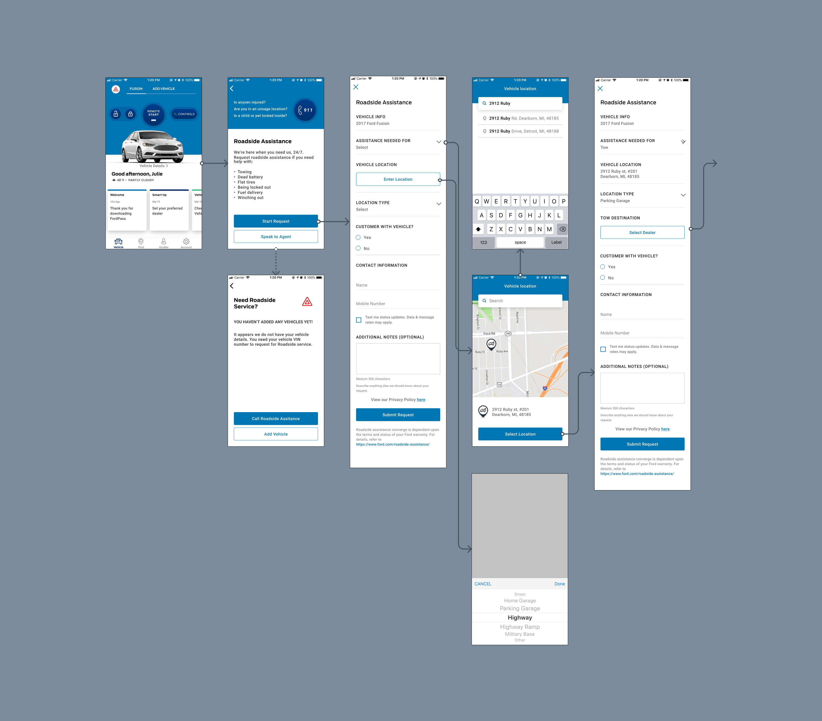
We got some initial feedback from users that they weren't clear on how the electronic request is better than speaking to an agent and unsure how much time it would take to complete the request. The flow was overwhelming, so we thought to simplify the flow by reducing the number of steps.
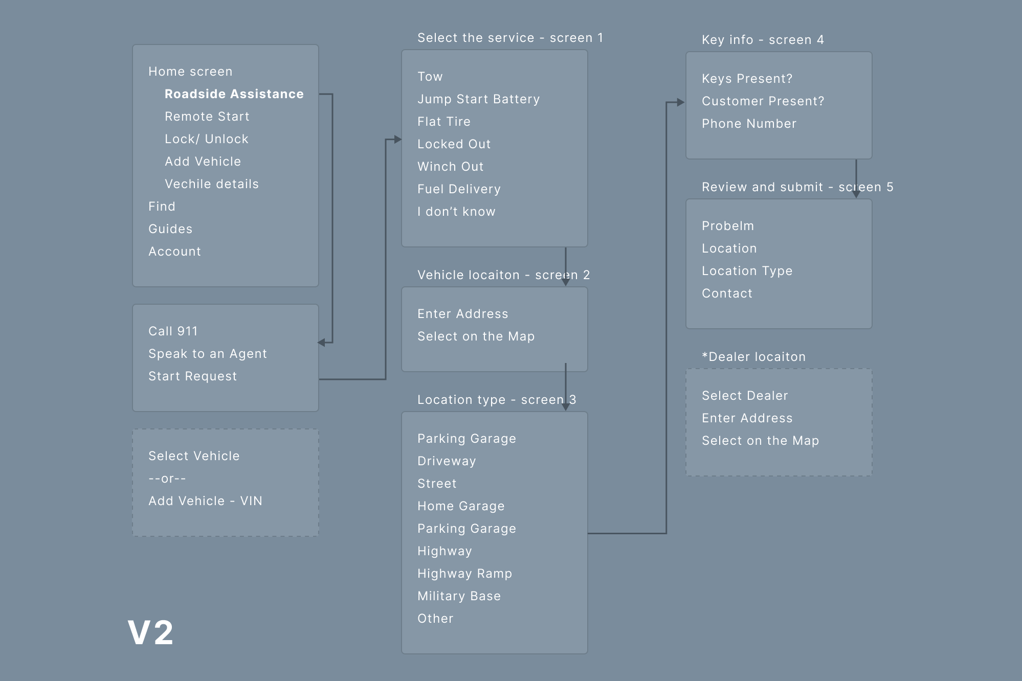
Based on the above flow, I built a prototype using a layered approach to divide each section into separate screens. Each screen asks the user what kind of a problem they face to gather information.
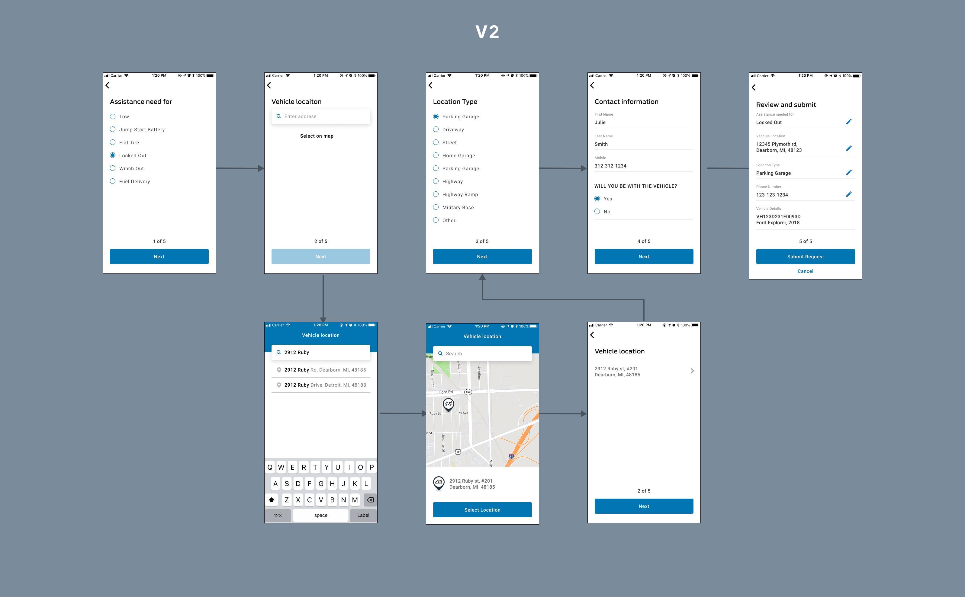
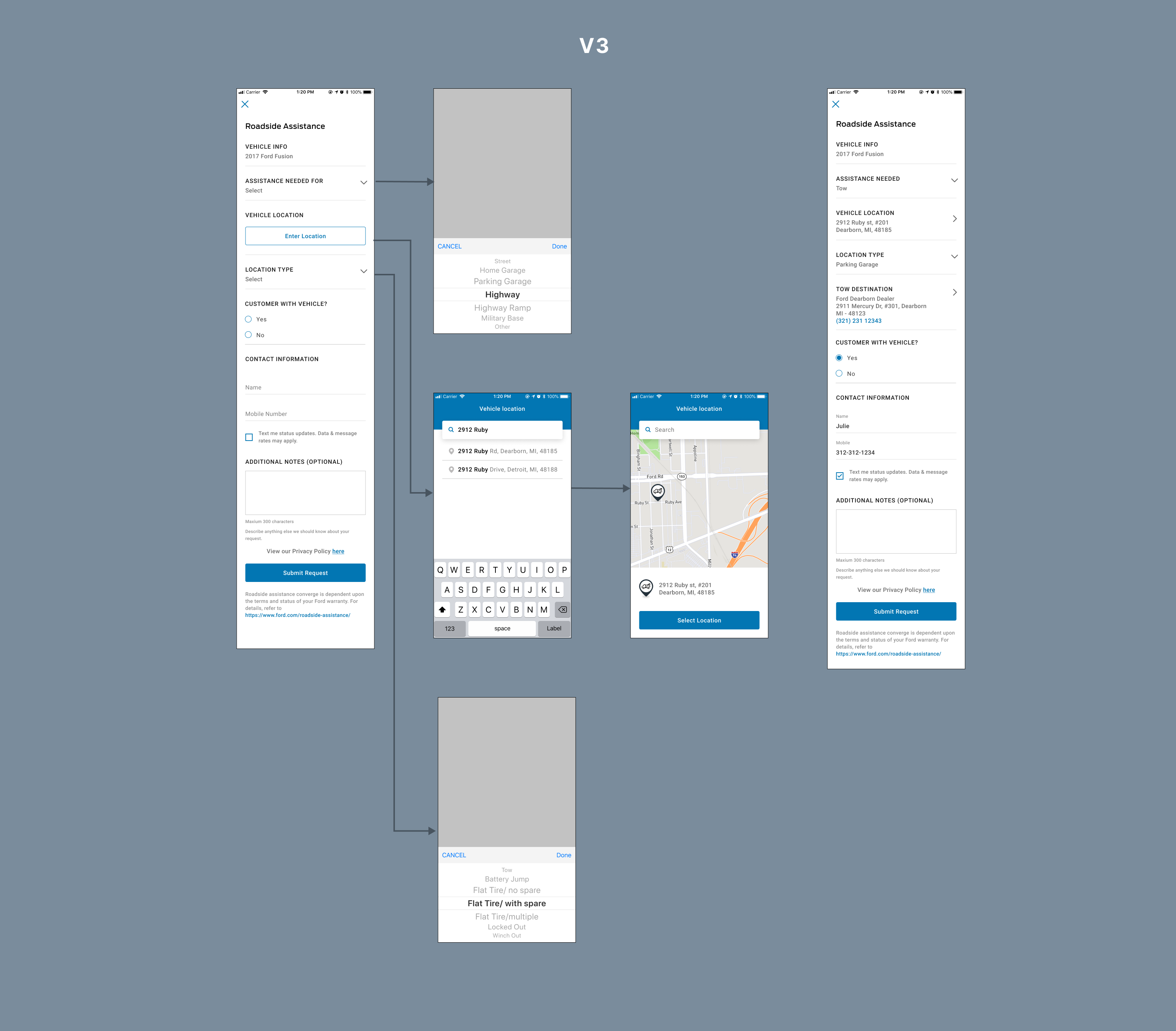
Heuristically, the number of layers felt overwhelming to someone who might have gotten stuck on a highway or in a forest area. So, I aggregated all the related form fields into one section, where users can see the information they need to provide to submit the request.
The user feedback was overwhelmingly positive based on the above flow, and I iterated on the prototype to make the experience simple and easy.
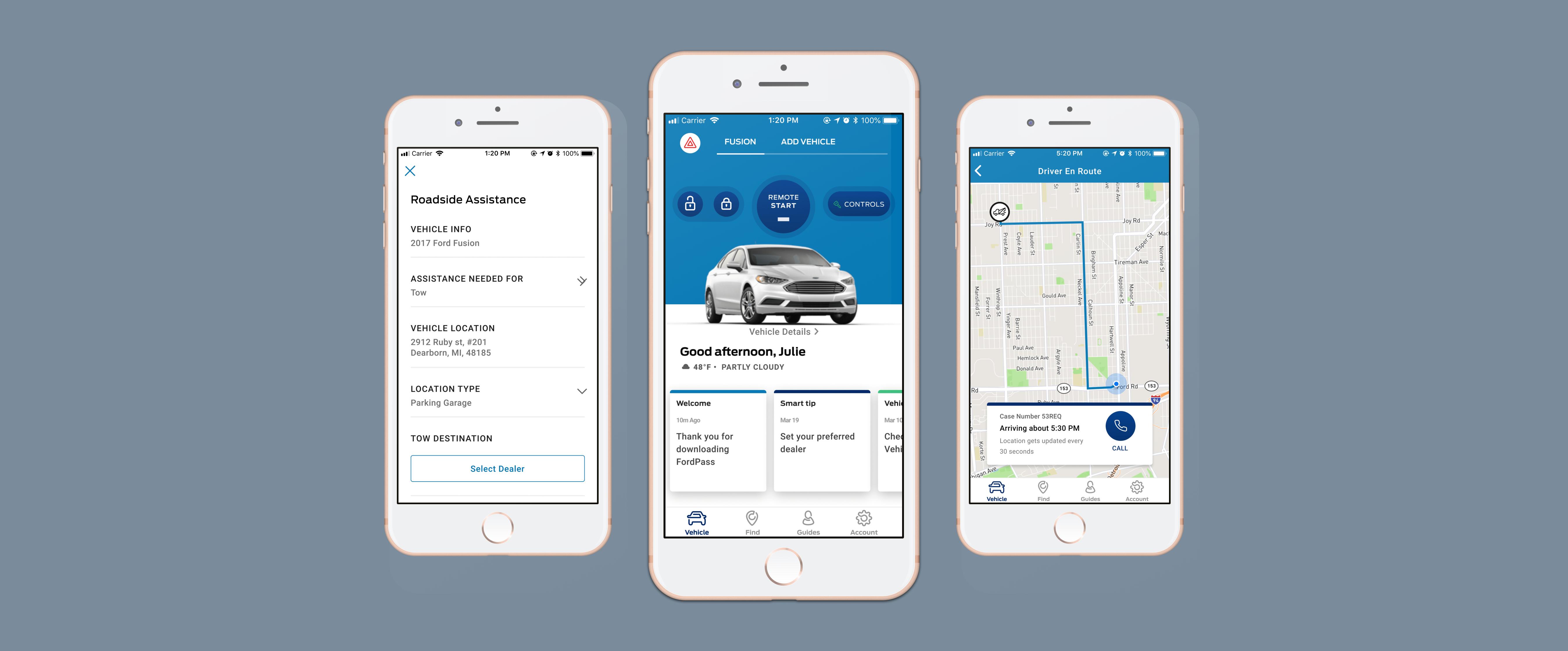
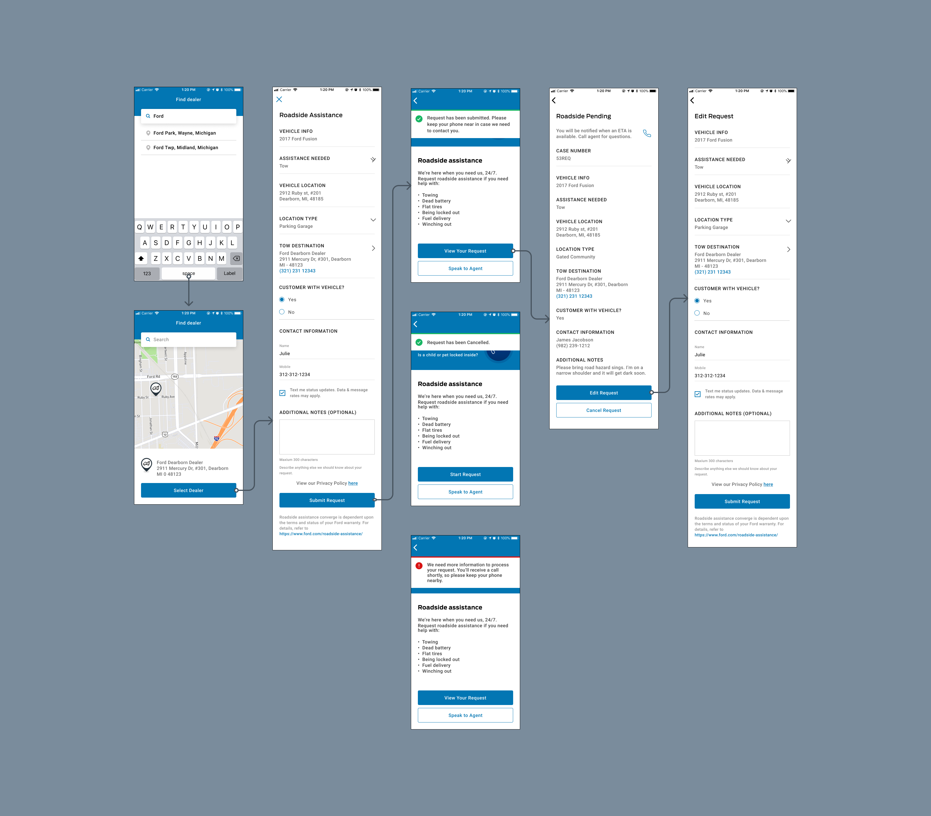
We got the information required and sent it to the service provider, but how to keep the user in the loop?
I build a prototype to track the service vehicle on the map and the arriving time, similar to Uber or Lyft. It is to calm the nerve of the user waiting and wondering where their service vehicle is and when it would arrive.
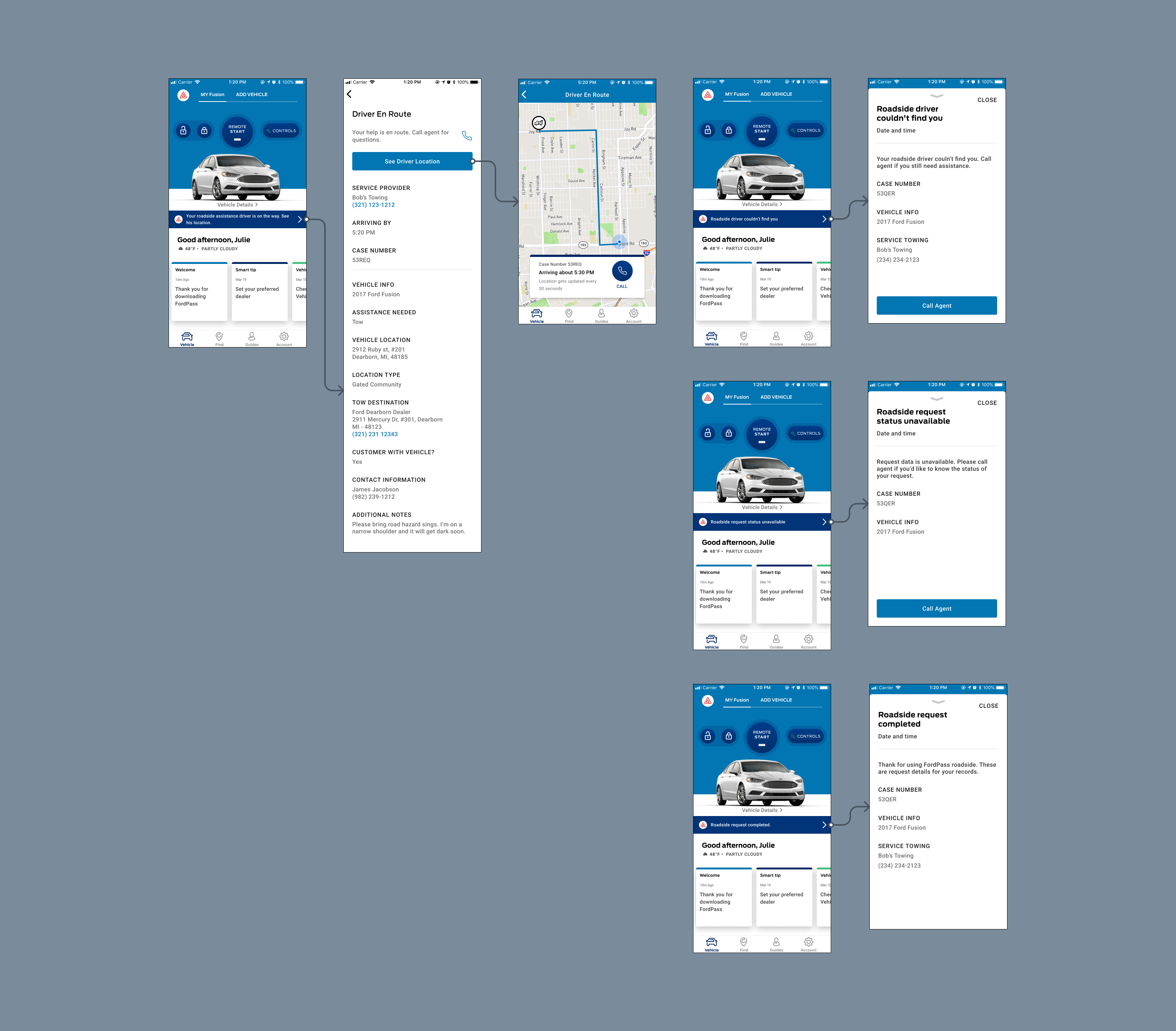
After the initial launch, we had 37% of the users requesting via the e-request form in a month. We got mixed feedback from the users based on the survey we sent out, mainly pointing out the map's service vehicle location not accurate or non-responsive.
It was good working with different teams to make this possible and deliver it on time. I learn how to research and provide the design in a tight window for a public-facing application. After I moved out of the team, the app was updated to reflect the Ford design system.
If you’d like to read more, I’ve published additional case studies for Mast Redesign and Manage Charging,FordPass. Read about me or go back to home.