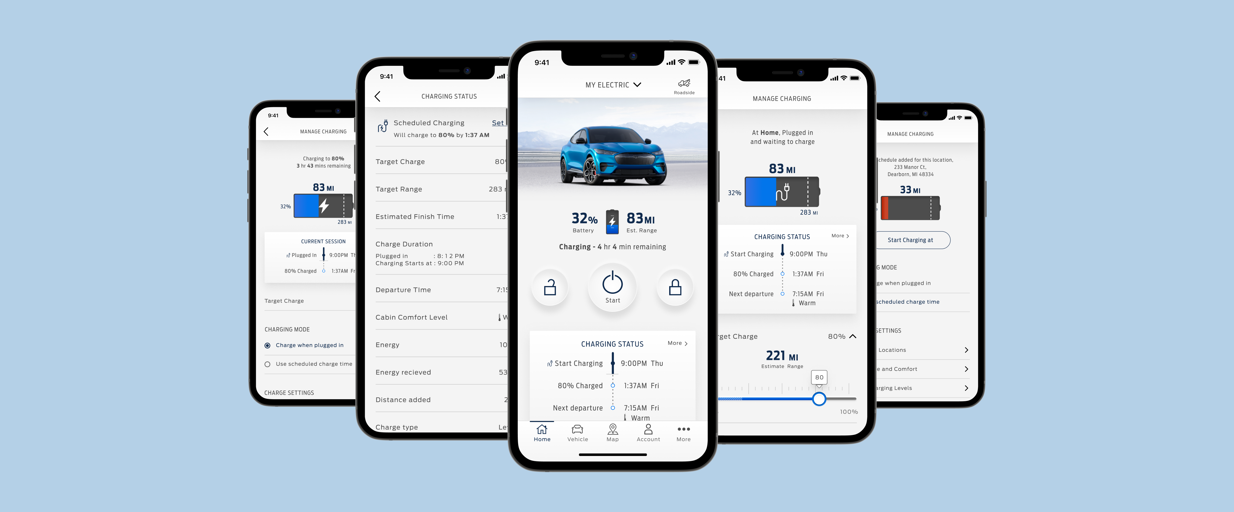
As a team, we found our current design wasn't flexible enough to accommodate features we planned to explore like Charging, Charging Status, Schedule Charging, Departure Time, Cabin Comfort, and Daily Charge level for the new Mach-E.
Over the course of a couple of months, I led the design with a researcher. I prototyped the new charging experience that would allow the users to monitor and manage their vehicle's charge through the application.
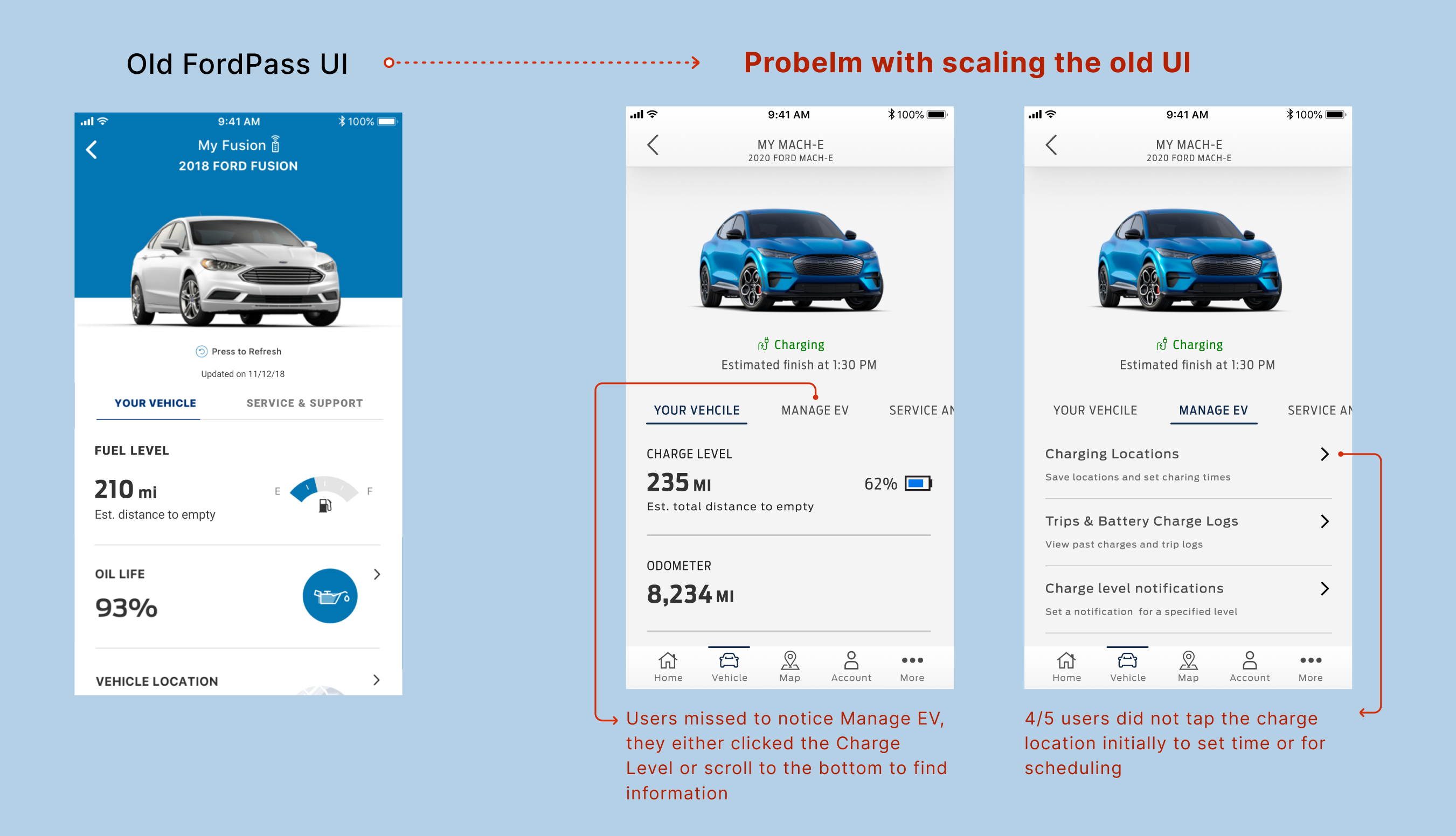
As Ford entered into the EV market with Mach-E, the opportunities also increased with FordPass to manage and customize the Mach-E's charging needs. Monitoring the charge status and customizing it - is essential for an electric vehicle, but building on top of the existing application designed for fuel vehicles was challenging.
Problems with the initial concept:
- Finding the Charging section was unintuitive as the users initially searched for the information elsewhere.
- Users were overwhelmed with multiple tabs on the screen and different flows.
Our goal was to create a simple application that would make FordPass appealing to the Mach-E owners, and ultimately have them use it to manage their vehicle's charging sessions. The primary metrics that measured how valuable the feature would be were:
- Percentage of people using the app to manage and customize the vehicle charging sessions
- Percentage of people monitoring the charge status from the app
I explored a few original workflows for the user stories based on the problems we found. We tried to pare it down to the essential workflows for an MVP.
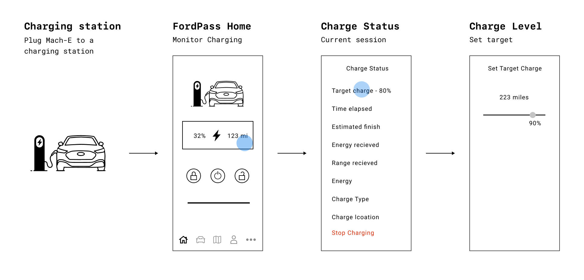
As someone who bought the new Mach-E, I want to plug my vehicle to the charging station and see the detailed charging progress anywhere from FordPass application.
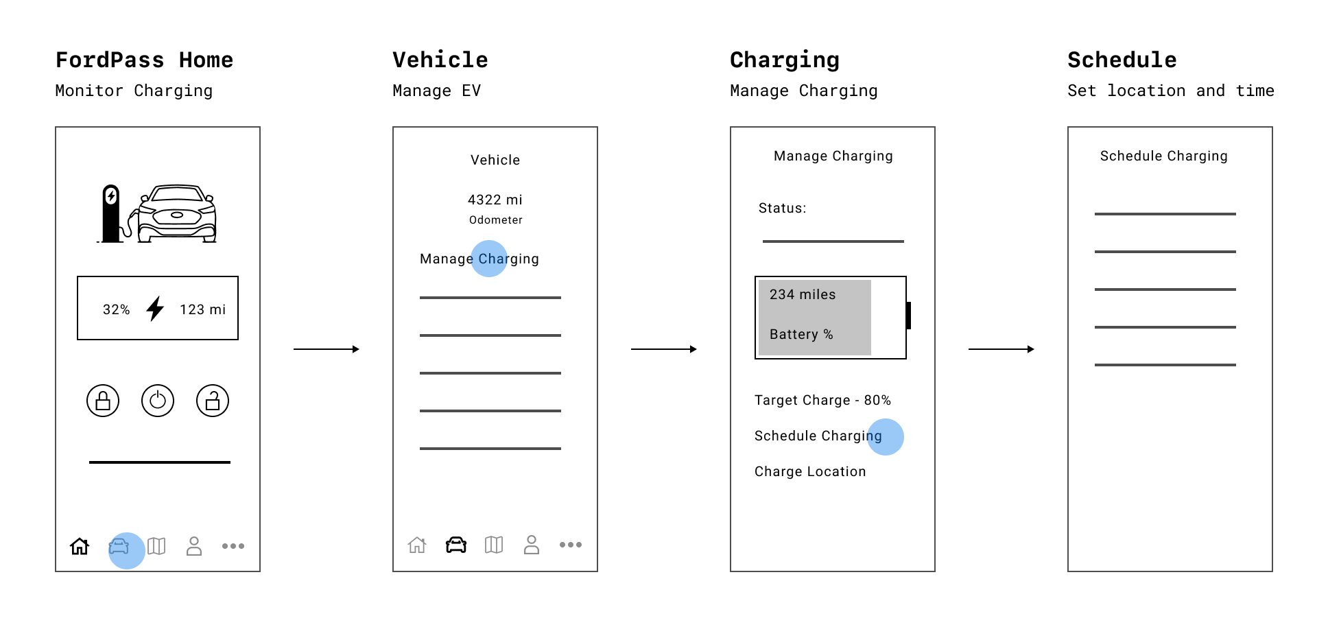
As someone who charges the Mach-E every day, I want to customize and create a charging schedule and departure time for different days and locations.
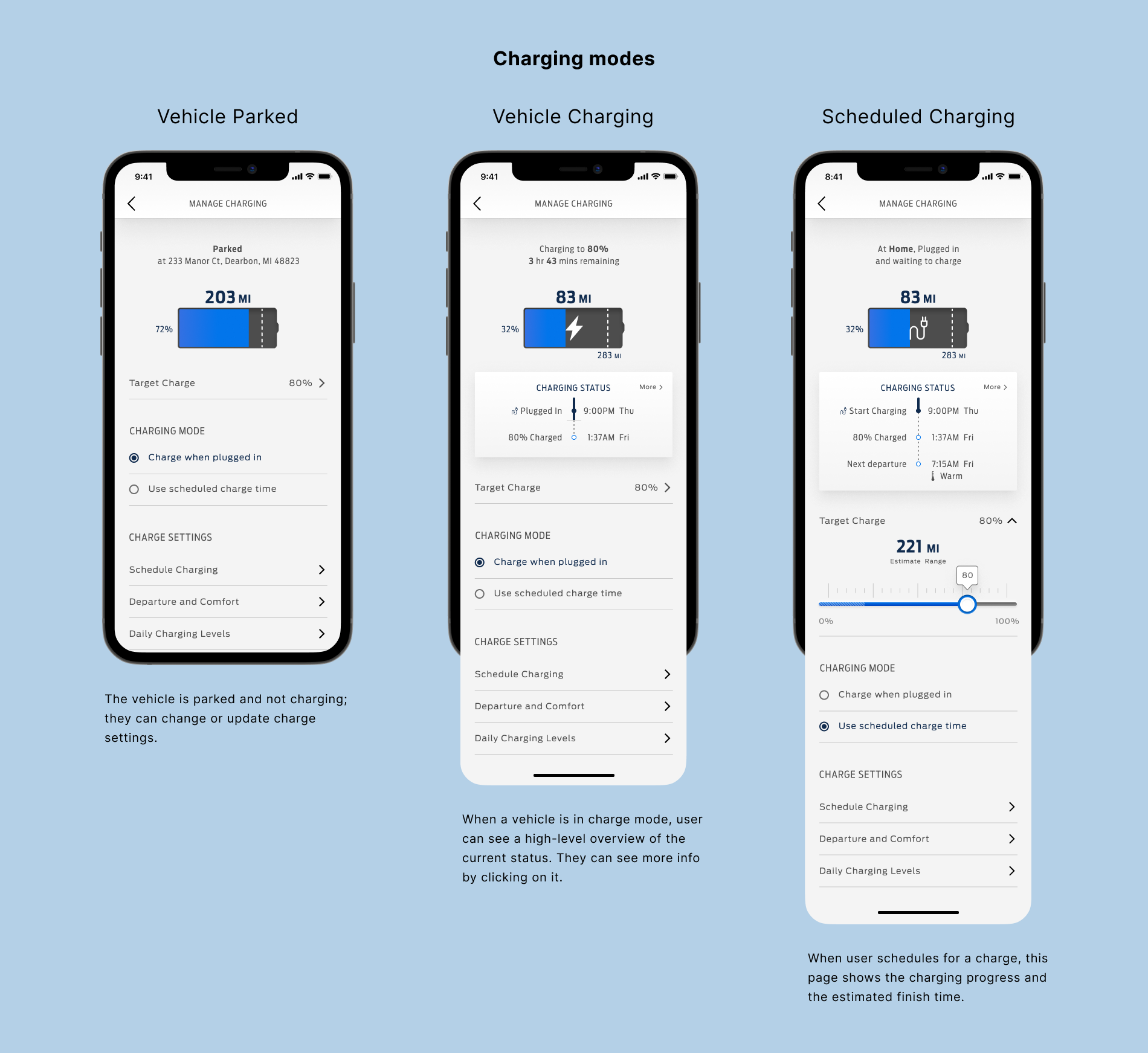
From there, we broke down the components that would be required to fulfil these workflows. First was the charging screen — a place to manage and customize the new Mach-E's charging capabilities. The idea was to have an intuitive flow to engage the user.
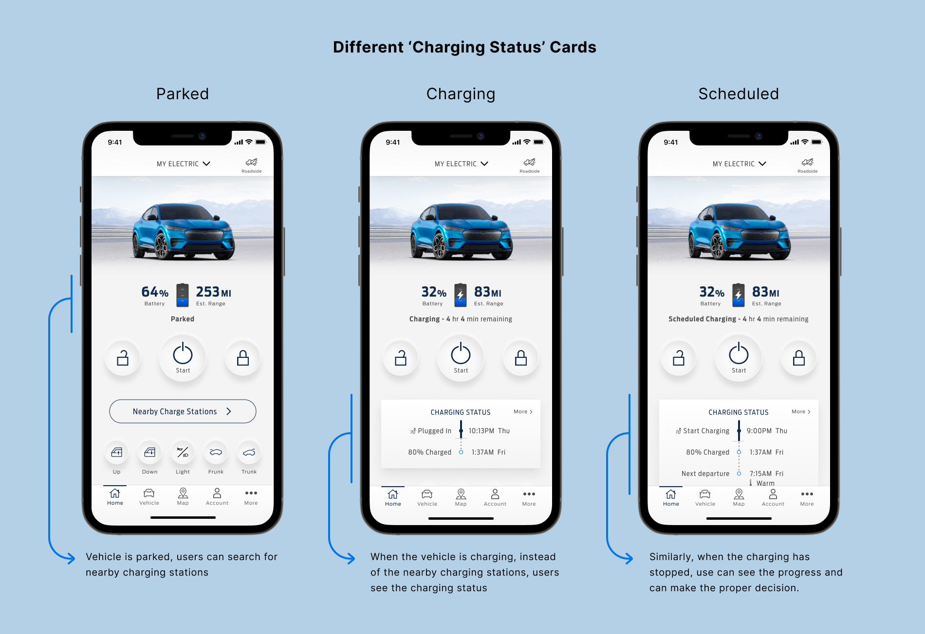
We created the Charging Status card to be scalable to show the information in different modes - when the vehicle is plugged and charging, and when it is a scheduled to charge. The card also shows the departure time and cabin comfort level if provided.
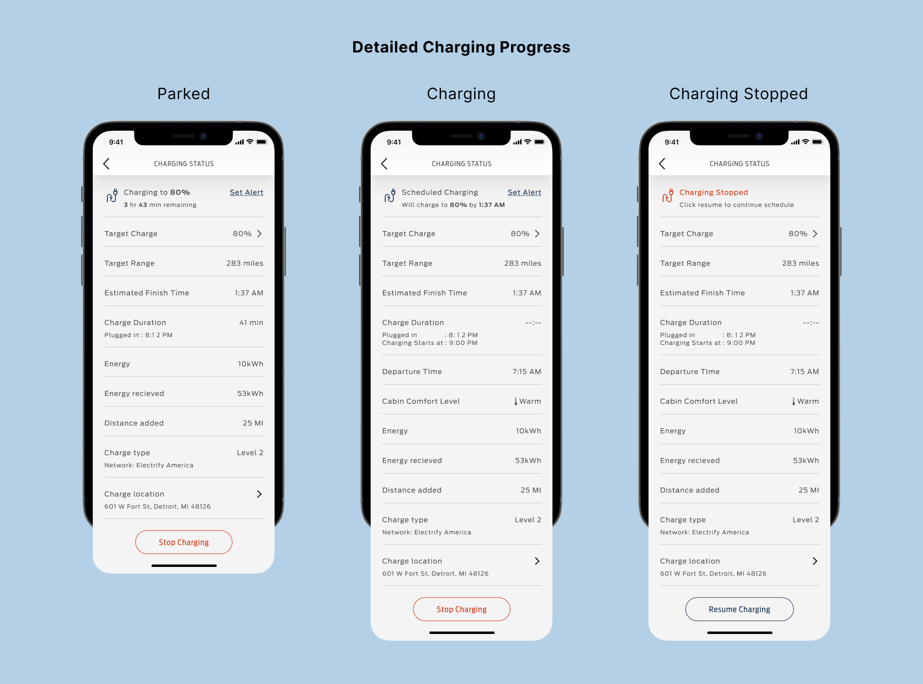
Similarly, to show the rest of the information about the charging session, we landed on a simple screen that lists the essential information, allowing users to modify or pause the charging if needed.
Early on, I learned that scheduling and departure time is different, and they both serve a different purpose. I explored and iterated on the UI with feedback from my team and a few internal users. We did usability testing with ten internal people who use EV as their personal vehicle for this feature. Apart from the UI elements, users also mentioned:
- Users wanted a third option to set the mode to Automatic based on the location
- Charging location and Time did not resonate with scheduling
- Users wanted a shortcut to this feature from the Home screen
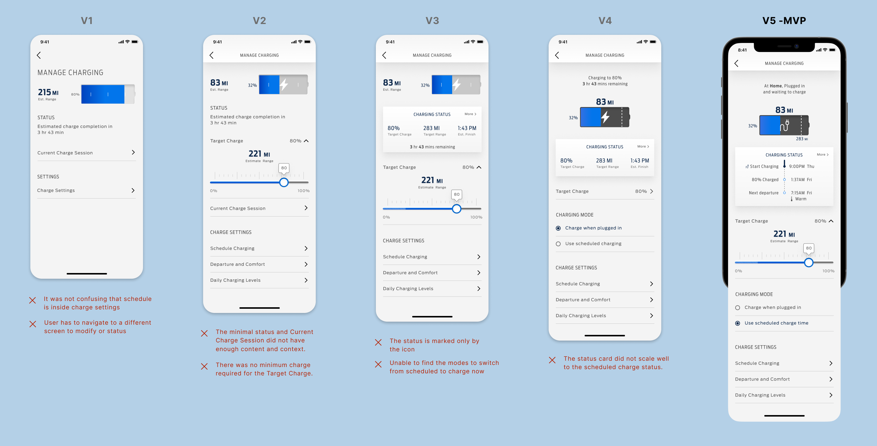
I sit in on sprint planning with Product Manager and help write Rally tickets so that the right features get built in the right order, the right way. We use Invision to share the designs and prototype with the developers and use comments to keep tabs on the feedback. The final design ended up with a simple flow and allowed users to manage and customize their new Mach-E's charging capabilities.
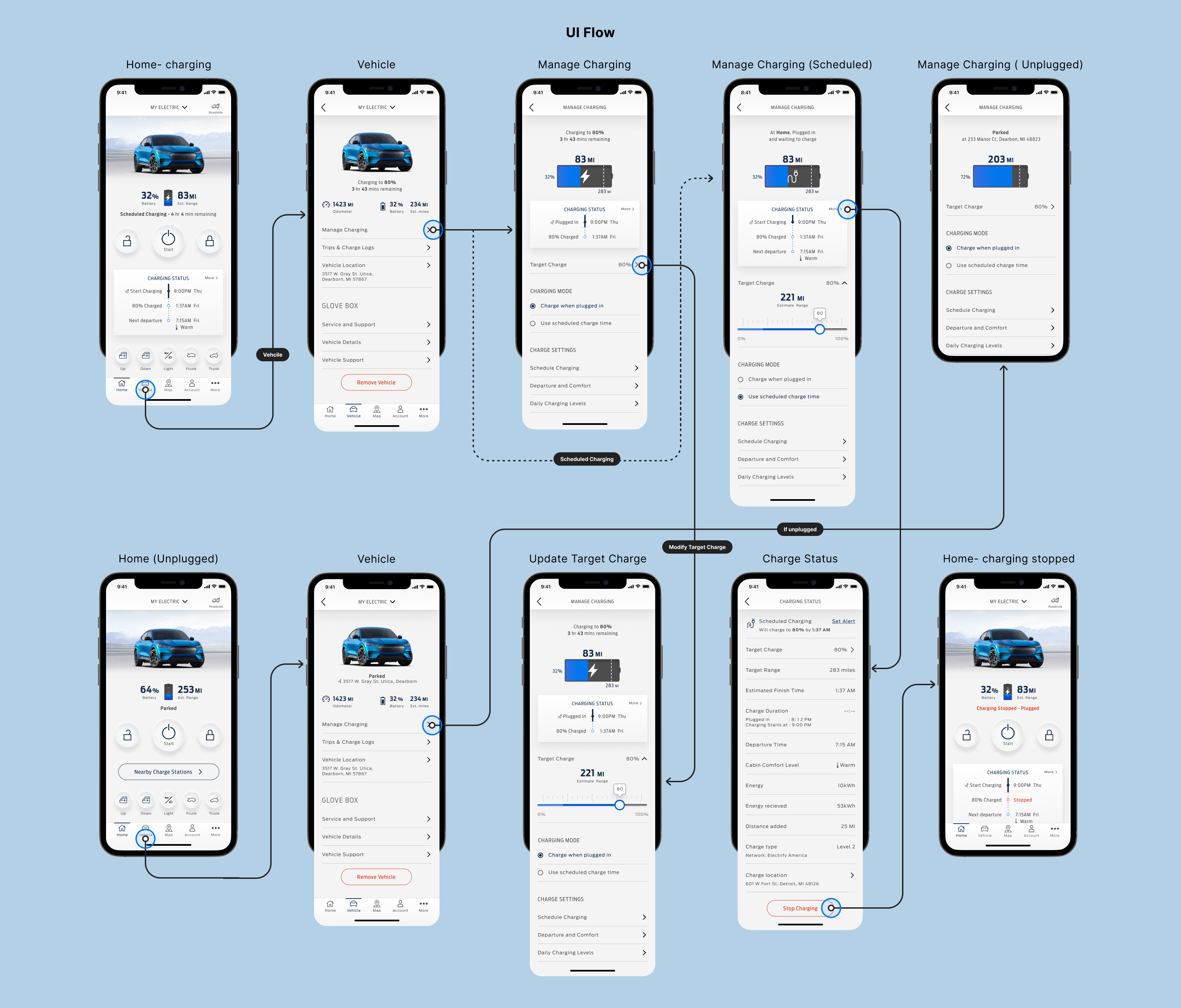
Since all the features on FordPass are linked directly to the vehicle, it is essential to connect with the cross-functional teams to align with the requirement and feasibility. We have the features in beta and continuing to get feedback from users and iterating on the designs to improve the user experience.
If you’d like to read more, I’ve published additional case studies for Mast Redesign and Roadside Assistance, FordPass. Read about me or go back to home.