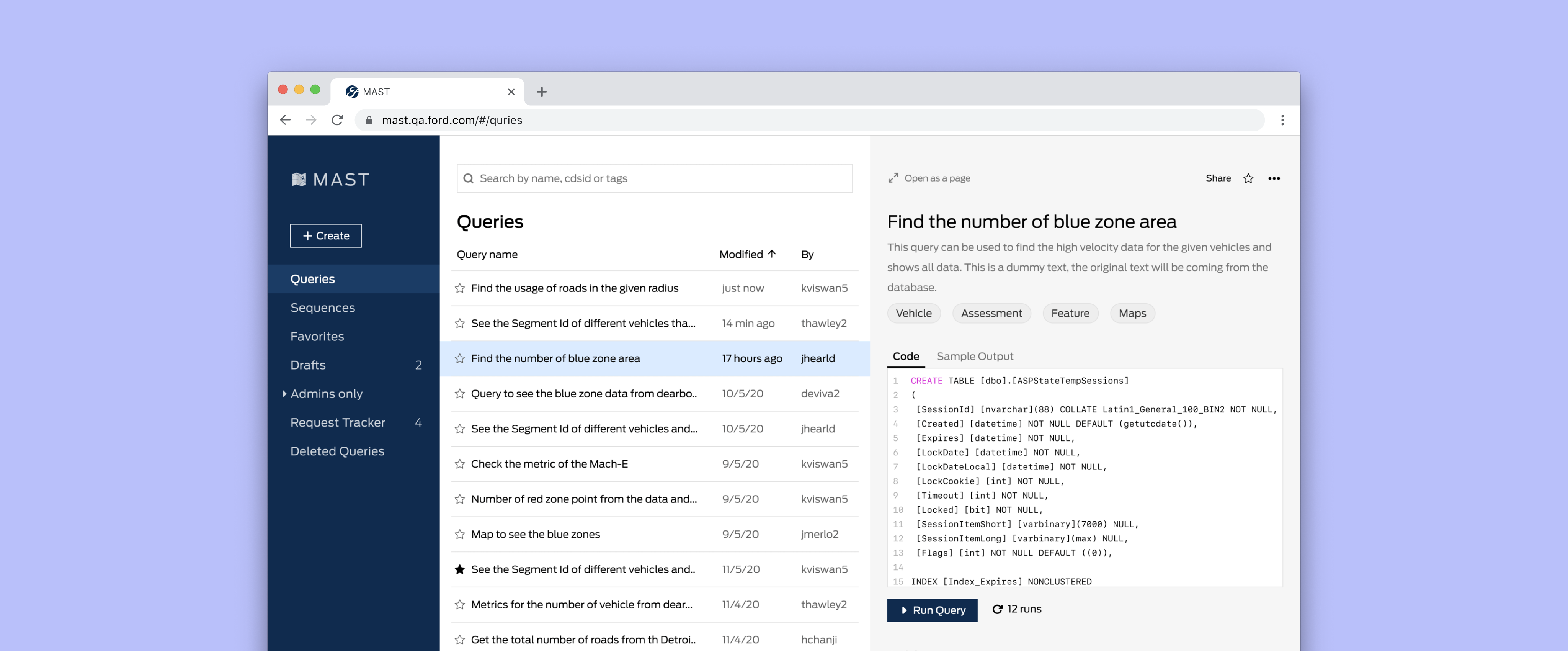
MAST has some unique capabilities that can change the way people work at Ford. However, we've made it difficult for the data scientist to adopt the platform by not looking at their workflow.
The redesign's main goal was to make the platform simple enough to use and increase discoverability. The platform should be clear, consistent and accessible that can scale for future product and releases.
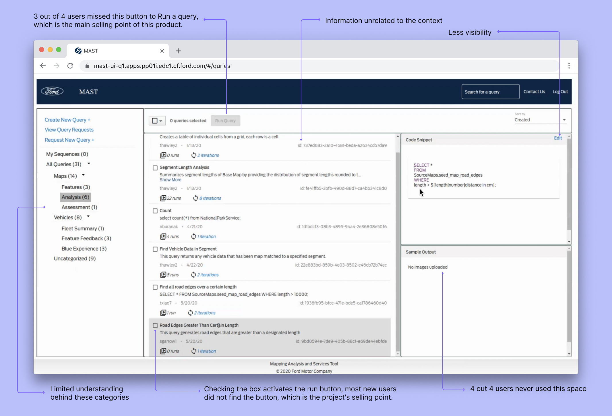
Data scientists upload their SQL/Python queries to the MAST platform to share it with the bigger audience based on the request. But, MAST didn't work the way people worked. We received a lot of feedback from the users about the discoverability of the essential features. Similarly, creating a query is time-consuming and loses the context very fast. It leads to poor engagement on the platform.
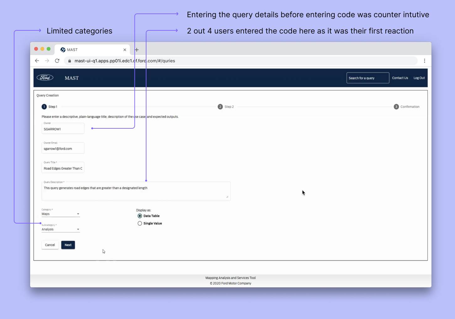
For example, when a user wants to create a query, it should be simple to enter the code and save it, but rather the user has to complete a three-step process, and if they are editing, it is a four-step process. It was also counterintuitive to enter the title, description and category first and code later.
Similarly, the UI did not validate the code before adding it to the database which got poor feedback. Instead, the creator has to add a picture of the result to the database manually. This showed that we need to understand the user workflow better.
I explored a few different workflows to simplify the user stories based on the problems we found. We tried to pare it down to the most essential workflows for an MVP.

We landed on creating resuable componets that would scale with the product. We reduced the steps to create a query and added the ability to run before saving.
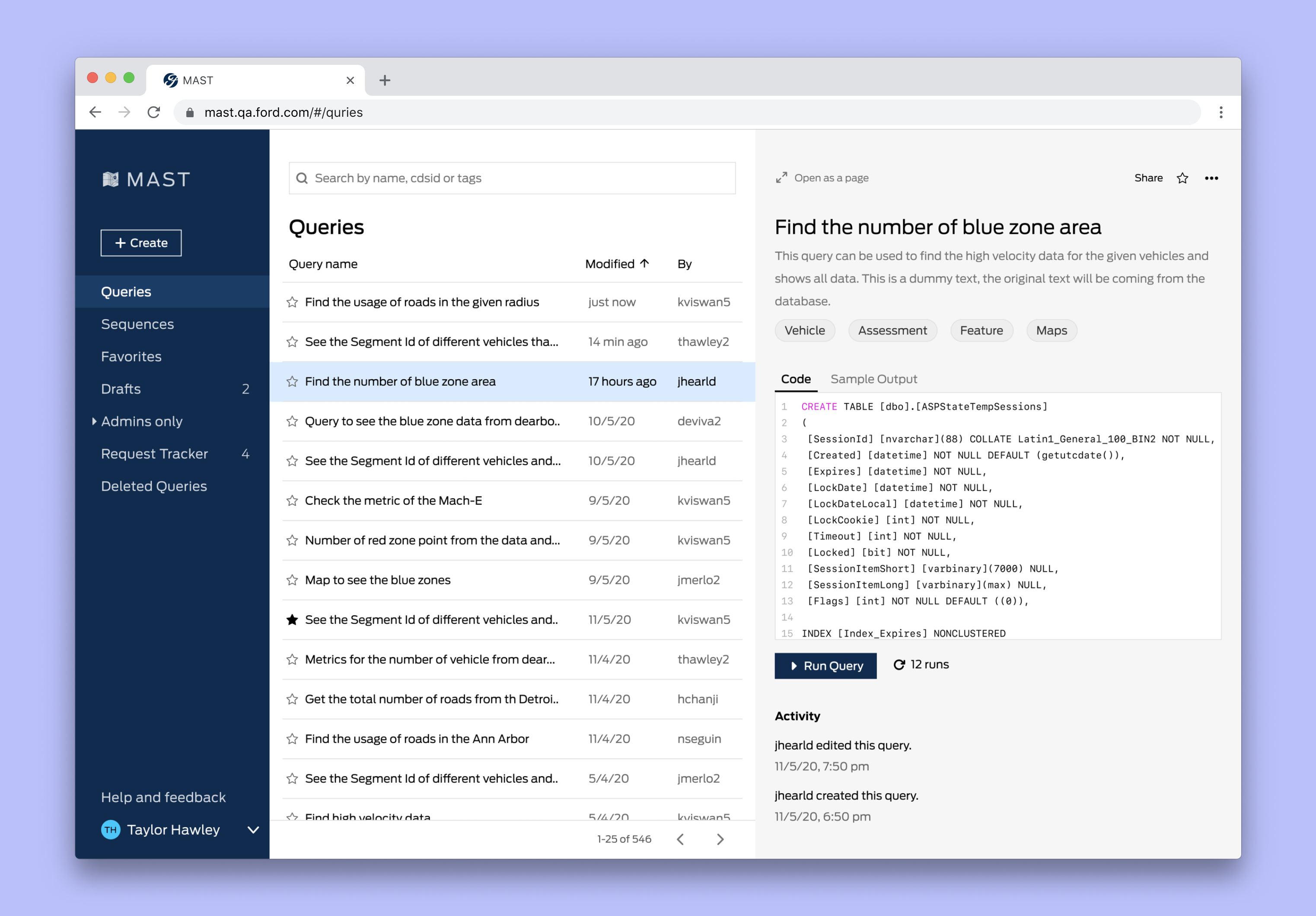
We made the navigation simpler and grouped relevant information. We completely took a different take on the sidebar, we removed the categories and introduced tags. This means...
- We reframed MAST as not just a query storing platform, but also a platform that can run and produce real-time results
- We refined the sidebar and to be scalable to grow without bloating with unnecessary information
- We distilled the number of information on the middle pane and moved it to the right, making it easier when searching a query
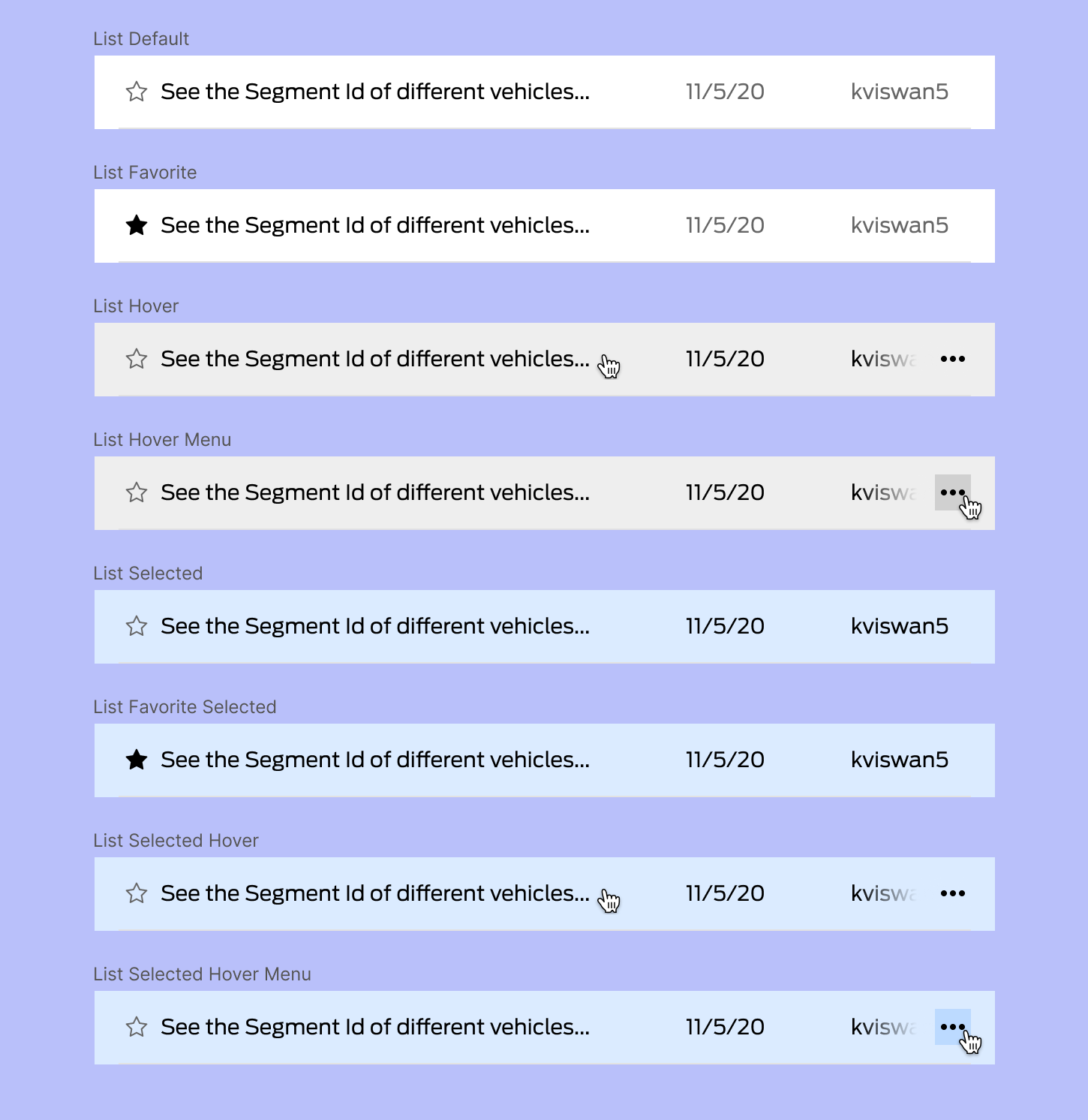
We moved the description and runs to the details and added a menu button to see more detials. I explored a variety of visual treatments for this cause and landed on the above design.
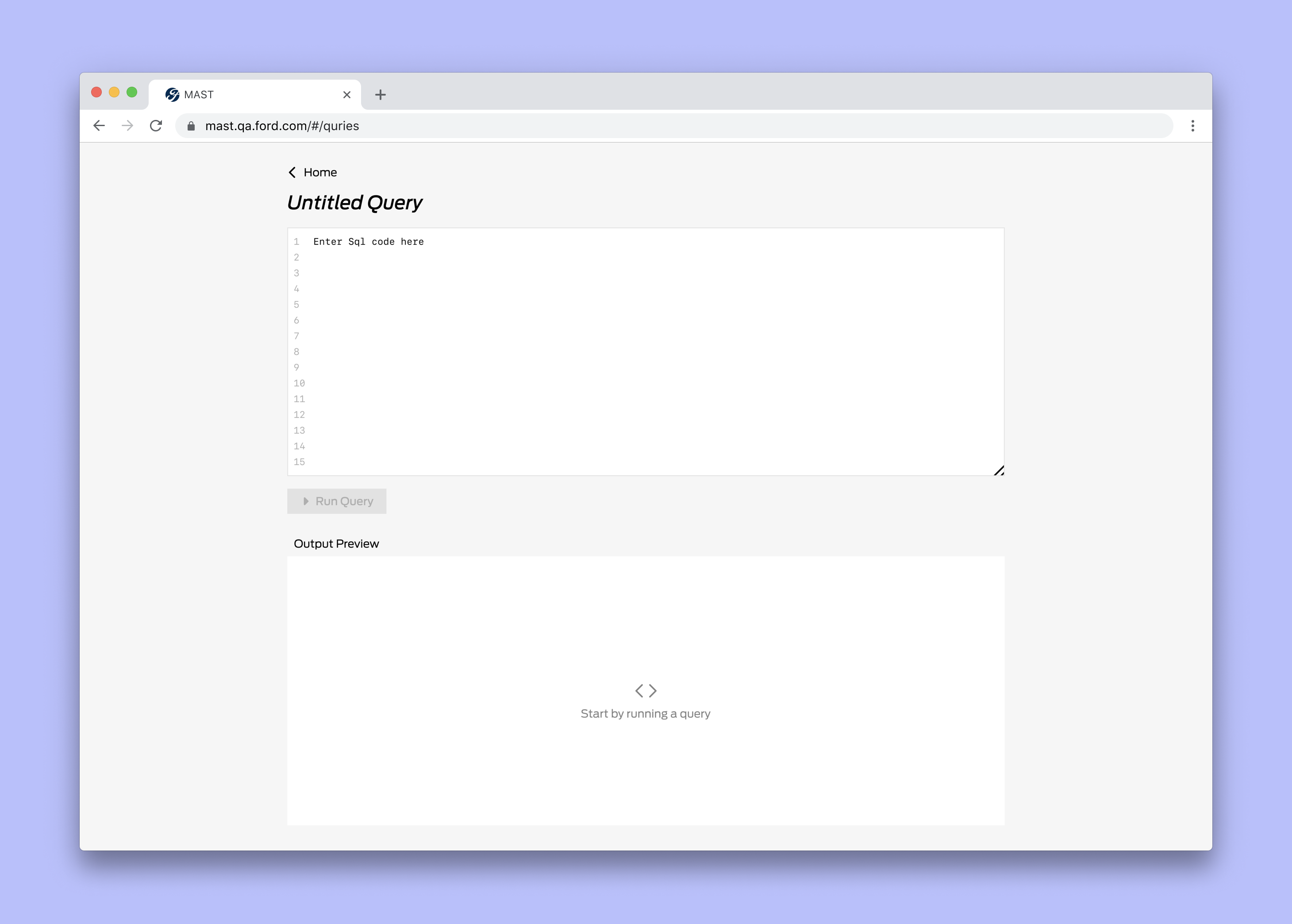
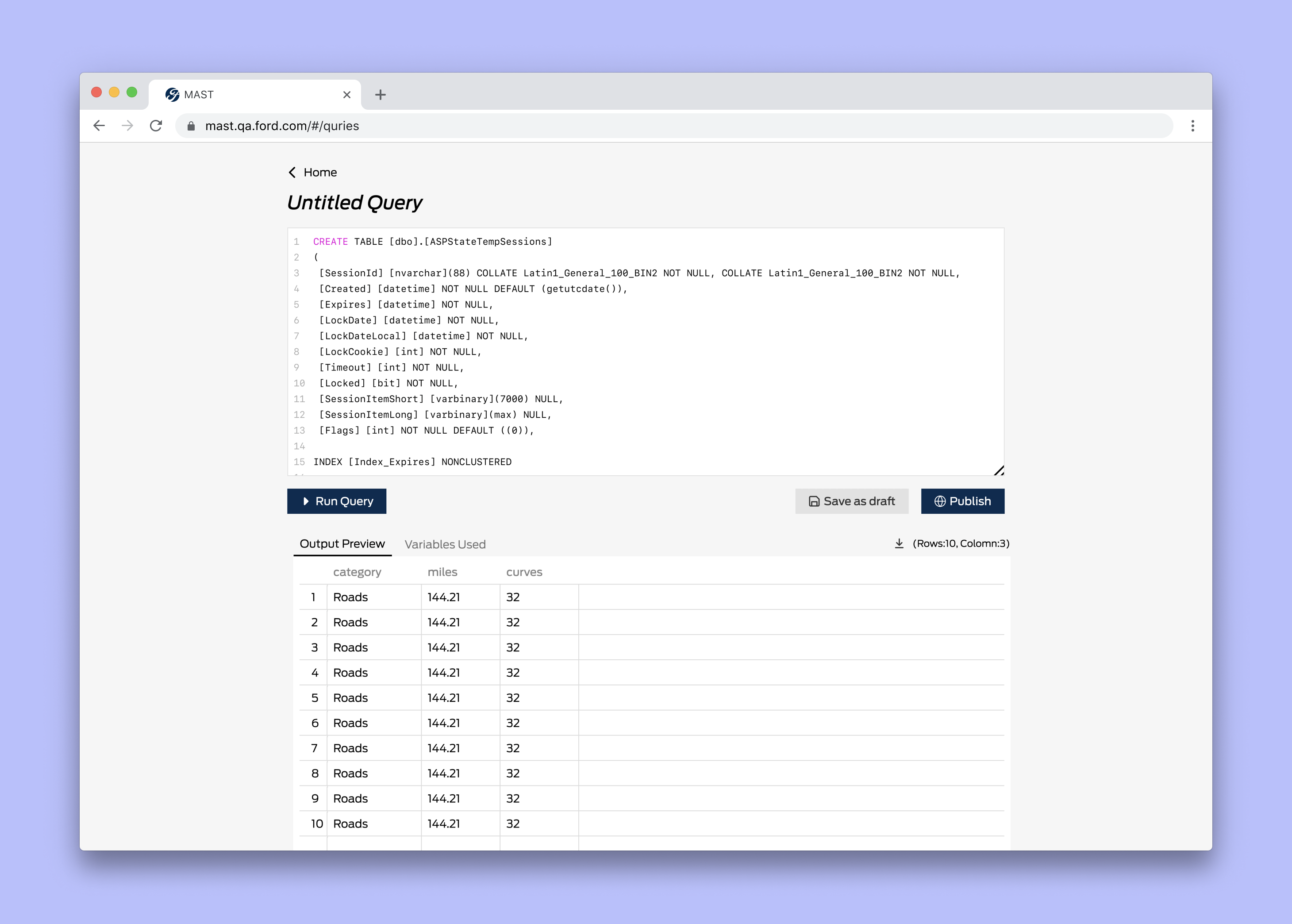
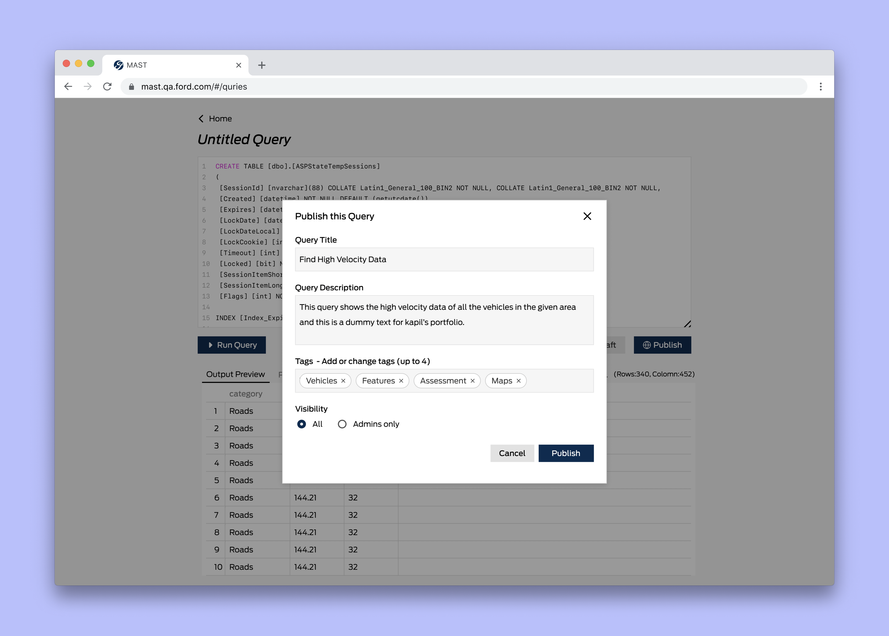
The redesign and the new navigational flow enabled users to discover and access related workflow faster. It enabled the roll-out of new features much smoother.
In September 2020, We launched this redesign to a small set of data scientists. After demonstrating that it didn’t negatively impact key metrics, we decided to roll the redesign out to a bigger audience by December 2020. We have a lot of feature requests already from users and there is more to come in the future.
If you’d like to read more, I’ve published additional case studies for Manage Charging and Roadside Assistance, FordPass. Read about me or go back to home.